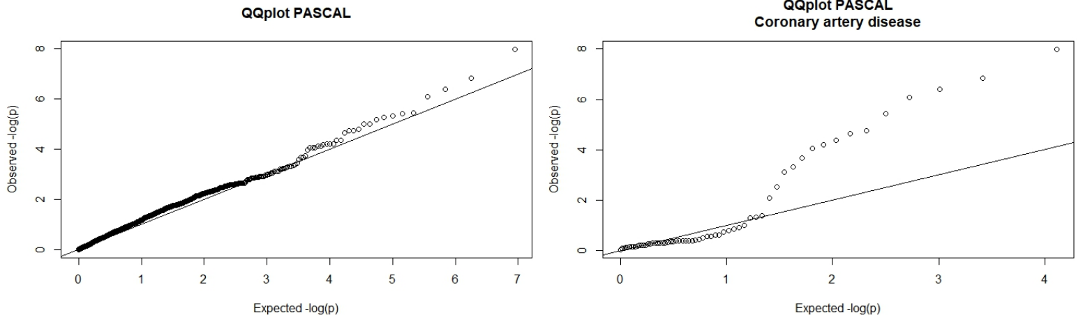
File:Qqplots.png
Size of this preview: 800 × 238 pixels. Other resolutions: 320 × 95 pixels | 1,565 × 465 pixels.
Original file (1,565 × 465 pixels, file size: 105 KB, MIME type: image/png)
P-values represent the strength of the association of the modules to a GWAS. The graph on the left represent the p-values of all GWASs, and the other represents the p-values of the only GWAS that came out significant. On y-axis, it is the distribution of our p-values ; on x-axis, it is a random distribution. If a p-value is lower than expected if random, the dot will lay under the straight line (qqline). The smallest p-value corresponds, on the qqplot, to the dot that is the highest and laying on the left of the line (module 692).
File history
Click on a date/time to view the file as it appeared at that time.
| Date/Time | Thumbnail | Dimensions | User | Comment | |
|---|---|---|---|---|---|
| current | 23:08, 29 May 2018 | 1,565 × 465 (105 KB) | Sbprm2018 3 (talk | contribs) |
- You cannot overwrite this file.
File usage
There are no pages that link to this file.