Difference between revisions of "Bacterial cross-resistance"
Sbprm 2019 1 (talk | contribs) |
Sbprm 2019 1 (talk | contribs) |
||
| Line 36: | Line 36: | ||
'''Mathematical model''' | '''Mathematical model''' | ||
| − | + | ||
| + | [[File:Xres Formula1.png]] | ||
Model predicting the change in growth rate according to the expression levels of the genes : | Model predicting the change in growth rate according to the expression levels of the genes : | ||
| Line 53: | Line 54: | ||
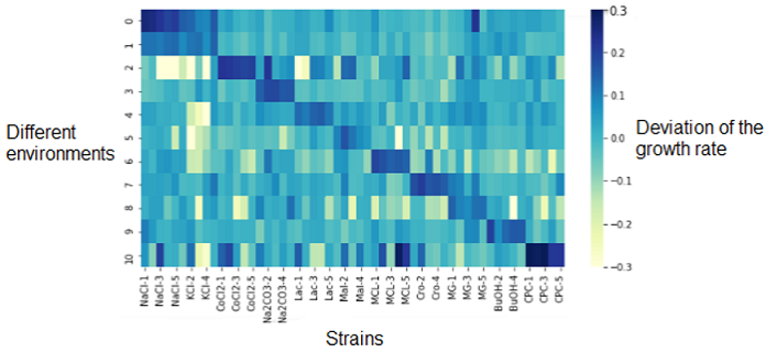
The first analysis we did was an heatmap that represented the deviation of the growth rate from the parents represented at 0.0 and depending on the media (on the left Y-axis). On the X-axis are the different replicates of the resistant strains. | The first analysis we did was an heatmap that represented the deviation of the growth rate from the parents represented at 0.0 and depending on the media (on the left Y-axis). On the X-axis are the different replicates of the resistant strains. | ||
| − | + | ||
| + | [[File:Xres Heatmap.png]] | ||
The dark diagonal represents the logical correlation between the media and the strain resistant to this media. The correlation is high since the resistant strain to NaCl is resistant to NaCl media. | The dark diagonal represents the logical correlation between the media and the strain resistant to this media. The correlation is high since the resistant strain to NaCl is resistant to NaCl media. | ||
| Line 65: | Line 67: | ||
Then we wanted to know which genes were the most differentially expressed so we used two approaches. The first one, a “simple” approach, was to simply sort the most over- and underexpressed genes. We postulated that the lowest ones (the under-expressed) could be due to deletions. Then, we compared our results with the authors’ list of mutations, that they made by sequencing. With this list, we could observe if some outliers that we found were part of it. | Then we wanted to know which genes were the most differentially expressed so we used two approaches. The first one, a “simple” approach, was to simply sort the most over- and underexpressed genes. We postulated that the lowest ones (the under-expressed) could be due to deletions. Then, we compared our results with the authors’ list of mutations, that they made by sequencing. With this list, we could observe if some outliers that we found were part of it. | ||
| − | + | ||
| + | [[File:Xres Compare Hist List.png]] | ||
| + | |||
| + | |||
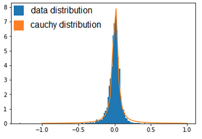
Thanks to that, we were able to confirm a few deletions but this method does not mean a lot more, so we needed to use a more statistical approach. This second approach was to observe the distribution of every values thanks to an histogramme and see which kind of distribution it followed to be able to get the p-value of the outliers. After standardizing the data, our first instinct was that it might have followed a normal distribution, but, after verification, we saw it wasn’t fitting the data correctly. We tried some other distribution and found that the cauchy distribution seemed appropriate. | Thanks to that, we were able to confirm a few deletions but this method does not mean a lot more, so we needed to use a more statistical approach. This second approach was to observe the distribution of every values thanks to an histogramme and see which kind of distribution it followed to be able to get the p-value of the outliers. After standardizing the data, our first instinct was that it might have followed a normal distribution, but, after verification, we saw it wasn’t fitting the data correctly. We tried some other distribution and found that the cauchy distribution seemed appropriate. | ||
Now we calculated the p-value of the outliers to see how unlikely they were to be different from the parents, which could point to the important mutations. | Now we calculated the p-value of the outliers to see how unlikely they were to be different from the parents, which could point to the important mutations. | ||
| − | |||
| − | + | [[File:Xres Hist.png]] | |
| − | |||
| − | + | From this, we got a list of the most under-expressed genes with their p-value. By comparing our final list with the authors’ list of mutations. It is possible to see that we could find some of the genes in the authors list, but many are not there. There could be two explanation for that : | |
| − | |||
| − | Genes are linked : Genes are linked by proximity in the genome, therefore if there is a mutation, for example a deletion, the genes would be deleted together. So the authors only mentioned a large deletion that included many of the genes we found. | + | 1) Genes are in a cascade : the transcription of one gene is necessary for the other genes. Therefore if the first is mutated thus not functional, the following genes won’t be transcribed. So only the first gene of this cascade was identified in the sequencing. |
| + | |||
| + | [[File:Xres explain1.png]] | ||
| + | |||
| + | |||
| + | 2) Genes are linked : Genes are linked by proximity in the genome, therefore if there is a mutation, for example a deletion, the genes would be deleted together. So the authors only mentioned a large deletion that included many of the genes we found. | ||
| + | |||
| + | [[File:Xres explain2.png]] | ||
| Line 95: | Line 104: | ||
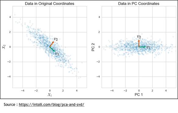
The second method is the Sparse Principal Components Analysis (SparsePCA). A regular PCA consists of putting genes in relation to propose a combination of genes that will best explain the variance. To do that, the axis system is modified to find a new one that can represent the variance of these genes. | The second method is the Sparse Principal Components Analysis (SparsePCA). A regular PCA consists of putting genes in relation to propose a combination of genes that will best explain the variance. To do that, the axis system is modified to find a new one that can represent the variance of these genes. | ||
| − | + | [[File:Xres PCA.png]] | |
| + | |||
| + | But this method have a weakness because it is a linear combination of every input so every genes. So with it doesn’t take off any genes, it only simplify. To solve that, we used the sparse PCA, which is a kind of combination of the Lasso and the simple PCA methods. It still finds a new axis system like the PCA, but one where there is only a subset of the genes that contribute to the basis vectors. Finally, the resulting components can be used in a regular linear regression to get the model. | ||
| + | |||
| − | |||
| + | '''Cross Validation - How to determine the best method''' | ||
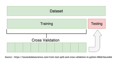
| + | To determine which model is the more appropriate in our situation, we used the Cross-Validation technique. It consist in splitting the data set in two subset. The “Train” subset, containing the majority of the original data, and the “Test” subset. The first subset will be use to modelize using the two techniques and then it will be possible to use the second one to try and predict the growth rates of those specific points. It is then recommended to repeat this with every possible split to end up with an average Mean Squared Error that will be less influenced by the randomness of the split. | ||
| − | + | [[File:Xres CrossVal.png]] | |
| − | + | The cross-validation will let us achieve three goals: | |
| − | |||
1) By repeating it with different restriction parameter (alpha) used to determine how much the model will try to reduce dimensionality of the data, we can find the best alpha for each technique. To do this, we’ll compile the Test and Train MSE of every alpha tested and represent them in a graphic. Then, by selecting the alpha corresponding to the minimum of the Test curve, we would have the best alpha for this model. We found that the best alpha value for the Lasso regression was around 0.006 and 0.008 depending on the try and that the best one for the SparsePCA was around 4.6. With more time, we could have done a more conclusive analysis by doing many repetition and selecting the average best value for each one. | 1) By repeating it with different restriction parameter (alpha) used to determine how much the model will try to reduce dimensionality of the data, we can find the best alpha for each technique. To do this, we’ll compile the Test and Train MSE of every alpha tested and represent them in a graphic. Then, by selecting the alpha corresponding to the minimum of the Test curve, we would have the best alpha for this model. We found that the best alpha value for the Lasso regression was around 0.006 and 0.008 depending on the try and that the best one for the SparsePCA was around 4.6. With more time, we could have done a more conclusive analysis by doing many repetition and selecting the average best value for each one. | ||
| − | + | [[File:Xres GraphLasso Sparse.png]] | |
| + | |||
| + | |||
| + | |||
2) With these best alphas founded, we now needed to check if these model were reliable to predict reality. For this, we simply had to compare the growth rates predicted by models to the real ones. Again, a graphical representation was the best way to easily visualize that. | 2) With these best alphas founded, we now needed to check if these model were reliable to predict reality. For this, we simply had to compare the growth rates predicted by models to the real ones. Again, a graphical representation was the best way to easily visualize that. | ||
| − | + | ||
| + | [[File:Xres Reliable.png]] | ||
| + | |||
| + | |||
Those are some examples of our results, but it represent the general situation and it is possible to see that, by looking especially at the test data (orange), that they are all relatively close to the diagonal, which would be the representation of a perfect prediction. So, we can conclude that the models seems to be reliable enough to continue. | Those are some examples of our results, but it represent the general situation and it is possible to see that, by looking especially at the test data (orange), that they are all relatively close to the diagonal, which would be the representation of a perfect prediction. So, we can conclude that the models seems to be reliable enough to continue. | ||
| + | |||
| + | |||
3) Finally, now that we learned that these model were good to predict reality, we need to see if one is better that the other. To do that, we simply compared the resulting MSE of both method to see which one was lower (more close to reality). These were the results. The checked technique is the more appropriate one for the specific medium. | 3) Finally, now that we learned that these model were good to predict reality, we need to see if one is better that the other. To do that, we simply compared the resulting MSE of both method to see which one was lower (more close to reality). These were the results. The checked technique is the more appropriate one for the specific medium. | ||
| − | + | [[File:Xres CompareMSE.png]] | |
| + | |||
| + | |||
| + | [[File:Xres Table.png]] | ||
| + | |||
| + | |||
| Line 134: | Line 159: | ||
Generally, our results helps to better understand the genetic origin of these resistances. The mathematical model built could be used to predict the transcriptome data for a desired beneficial resistance, by inverting the relation. This ‘’pseudo-inversion’’ would give us an approximation and not a unique solution. | Generally, our results helps to better understand the genetic origin of these resistances. The mathematical model built could be used to predict the transcriptome data for a desired beneficial resistance, by inverting the relation. This ‘’pseudo-inversion’’ would give us an approximation and not a unique solution. | ||
| − | + | [[File:Xres Formula2.png]] | |
Latest revision as of 20:54, 30 May 2019
By: Pierre-Luc BEAULIEU Camille DURGNAT Leila STUTZ
Supervised by : Daniel KREFL
Source article : “Prediction of Cross-resistance and Collateral Sensitivity by Gene Expression profiles and Genomic Mutations” by Takaaki Horinouchi, Shingo Suzuki, Hazuki Kotani, Kumi Tanabe, Natsue Sakata, Hiroshi Shimizu & Chikara Furusawa.
Contents
Article summary
The aim of this article was to understand underlying mechanisms of cross-resistance and collateral sensitivity in bacteria such as E.coli and more generally the origin of these resistances.
Cross-resistance and collateral sensitivity happens when one gene that acquires resistance to a specific compound can also bring resistance or sensitivity to another molecule. To understand these mechanisms could be useful for example in the antibiotics industry for example since antibiotics become less and less efficient due to fast-evolving organism developing resistance, but more generally, by building a model predicting the growth rate changes from the transcriptome data, it could allow us to then use the relation backward in order to predict transcriptoma data thanks to the growth rate data.
In this article, the authors wanted to demonstrate that resistance changes can be predicted quantitatively by looking at the changes in RNA sequences (transcriptome) of the resistant strains. They also mentioned that by using a combination of antibiotics, they could potentially suppress the apparition of a new resistance.
So in this experiment, their aim was to find a model and generally to better understand dynamic of resistance and sensitivity appearances.
Three data file provided with this paper were used for our projects : Transcriptome data containing the genetic expression levels of parents and of each mutant strain in every condition (natural or restrictive growth), Growth rates changes (relative to the parents) of the different strains on every restrictive medium and the Mutations list made by the authors of the article.
Experiment methodology
They treated the strains with eleven different stressors, such as salts (NaCl, KCl), alcohols, acids and so on. Then they created and isolated resistant strains to each stressors. The descendants of the resistant strains (parents strain) were then mutagenized with EMS or nitrous acid. They then sequenced the resistant strains and analysed the changes in the transcriptome. By measuring the expression levels of descendant mutants, it represented the change in growth rate under the stress or without. This allowed them to quantify how the acquisition of resistance affects the resistance to others stressors and build a mathematical model.
Mathematical model
Model predicting the change in growth rate according to the expression levels of the genes : With g = the change of the growth rate / alpha = effects of gene expression / X = gene expression / beta = fitting parameter
Our Python project
First analysis
Heatmap - visualisation of the growth data
The first analysis we did was an heatmap that represented the deviation of the growth rate from the parents represented at 0.0 and depending on the media (on the left Y-axis). On the X-axis are the different replicates of the resistant strains.
The dark diagonal represents the logical correlation between the media and the strain resistant to this media. The correlation is high since the resistant strain to NaCl is resistant to NaCl media. What we are more interested on this heatmap are the outliers (dark or light spots) outside of the diagonal. They represents strains that have a significantly different growth rate (over- or under-expressed) compared their parents on other mediums that those we could be expecting. This shows that the genetic changes in the bacterium that provide a resistance to its environment may also indirectly cause resistance or sensitivity to other media.
Comparison to the parental strains
To explain how the offsprings differs from the parents, we need to isolate the changes in expression between them. To achieve that, we compared the parent strain with the strains that grew on a nonrestrictive medium by subtracting from the second the parental expression, resulting in the difference in expression of the descendants.
Then we wanted to know which genes were the most differentially expressed so we used two approaches. The first one, a “simple” approach, was to simply sort the most over- and underexpressed genes. We postulated that the lowest ones (the under-expressed) could be due to deletions. Then, we compared our results with the authors’ list of mutations, that they made by sequencing. With this list, we could observe if some outliers that we found were part of it.
Thanks to that, we were able to confirm a few deletions but this method does not mean a lot more, so we needed to use a more statistical approach. This second approach was to observe the distribution of every values thanks to an histogramme and see which kind of distribution it followed to be able to get the p-value of the outliers. After standardizing the data, our first instinct was that it might have followed a normal distribution, but, after verification, we saw it wasn’t fitting the data correctly. We tried some other distribution and found that the cauchy distribution seemed appropriate. Now we calculated the p-value of the outliers to see how unlikely they were to be different from the parents, which could point to the important mutations.
From this, we got a list of the most under-expressed genes with their p-value. By comparing our final list with the authors’ list of mutations. It is possible to see that we could find some of the genes in the authors list, but many are not there. There could be two explanation for that :
1) Genes are in a cascade : the transcription of one gene is necessary for the other genes. Therefore if the first is mutated thus not functional, the following genes won’t be transcribed. So only the first gene of this cascade was identified in the sequencing.
2) Genes are linked : Genes are linked by proximity in the genome, therefore if there is a mutation, for example a deletion, the genes would be deleted together. So the authors only mentioned a large deletion that included many of the genes we found.
Build a model to understand the growth rates
The first option that come to mind when trying to modelize data is to try a linear regression, but in our case we have a lot of dimensions (4496 genes), therefore we cannot get a unique fit. Indeed, when we have too few datapoint compared to dimensions, so the fit is unstable and we can get multiple fitting line. In this case, some features don’t need to be considered since some can be redundant. Therefore, to resolve the problem, we needed to reduce the number of dimensions. To achieve that, two methods were proposed: the Lasso regression and the Sparse PCA.
How to reduce dimensionality
The first method is the Lasso regression using an L1 regularization. As we have seen in the Multivariata Regression, each gene contribute to the growth and has an beta coefficient. To find the growth, we have to do the summation of all the beta of each genes. This method consists of putting a threshold to the beta. So we have to determine which threshold fits the best and every beta that are under this limit, will be reduced to zero, so the gene too and it will diminish our number of dimensions, which is what we want.
The second method is the Sparse Principal Components Analysis (SparsePCA). A regular PCA consists of putting genes in relation to propose a combination of genes that will best explain the variance. To do that, the axis system is modified to find a new one that can represent the variance of these genes.
But this method have a weakness because it is a linear combination of every input so every genes. So with it doesn’t take off any genes, it only simplify. To solve that, we used the sparse PCA, which is a kind of combination of the Lasso and the simple PCA methods. It still finds a new axis system like the PCA, but one where there is only a subset of the genes that contribute to the basis vectors. Finally, the resulting components can be used in a regular linear regression to get the model.
Cross Validation - How to determine the best method
To determine which model is the more appropriate in our situation, we used the Cross-Validation technique. It consist in splitting the data set in two subset. The “Train” subset, containing the majority of the original data, and the “Test” subset. The first subset will be use to modelize using the two techniques and then it will be possible to use the second one to try and predict the growth rates of those specific points. It is then recommended to repeat this with every possible split to end up with an average Mean Squared Error that will be less influenced by the randomness of the split.
The cross-validation will let us achieve three goals:
1) By repeating it with different restriction parameter (alpha) used to determine how much the model will try to reduce dimensionality of the data, we can find the best alpha for each technique. To do this, we’ll compile the Test and Train MSE of every alpha tested and represent them in a graphic. Then, by selecting the alpha corresponding to the minimum of the Test curve, we would have the best alpha for this model. We found that the best alpha value for the Lasso regression was around 0.006 and 0.008 depending on the try and that the best one for the SparsePCA was around 4.6. With more time, we could have done a more conclusive analysis by doing many repetition and selecting the average best value for each one.
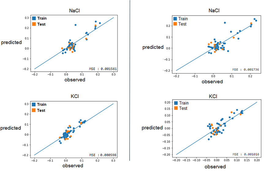
2) With these best alphas founded, we now needed to check if these model were reliable to predict reality. For this, we simply had to compare the growth rates predicted by models to the real ones. Again, a graphical representation was the best way to easily visualize that.
Those are some examples of our results, but it represent the general situation and it is possible to see that, by looking especially at the test data (orange), that they are all relatively close to the diagonal, which would be the representation of a perfect prediction. So, we can conclude that the models seems to be reliable enough to continue.
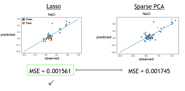
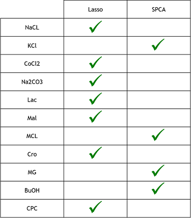
3) Finally, now that we learned that these model were good to predict reality, we need to see if one is better that the other. To do that, we simply compared the resulting MSE of both method to see which one was lower (more close to reality). These were the results. The checked technique is the more appropriate one for the specific medium.
Conclusion
From what we could do on this project, what we can conclude is that the Lasso regression technique seems to be the more efficient modelisation method. It was faster and simpler to code than the sparse PCA and, as we could see on the previous table of MSE, than those of the Sparse PCA. However, since we didn’t had the time to do as many replicate, the MSEs could change and it could be possible that Sparse PCA is better in some cases. The lasso regression seems also simpler than the method used in the research paper, where the authors used “genetic optimization”, which consist in taking a random subsets of their data and applying a statistical test on them. Afterwards, depending on the results, it would try again or alter the selection to get progressively the best MSE. It can be seen as a kind of directed Trial and error technique, which seems to take more time and to be more complicated to code than the Lasso regression.
If we had more time, beside what was mentioned before, we would also have tried to do more exploration with the data. For example, we could have tried to look the functions of the identified genes and pathways to see if it could explain the apparition of resistances. Furthermore, we could have tried to use the Lasso method differently. In this case, it was resulting in global selection of genes, which means it selects all the genes relevant for every medium and then for each medium, assigned coefficients to the important ones (unimportant ones = 0). It could have been interesting to see if the results were more accurate if we tried to select the most relevant genes for each medium individually How could we use these results ?
Generally, our results helps to better understand the genetic origin of these resistances. The mathematical model built could be used to predict the transcriptome data for a desired beneficial resistance, by inverting the relation. This ‘’pseudo-inversion’’ would give us an approximation and not a unique solution.

