Application of Wright-Fisher model for recombination landscapes
Contents
Credits
Authors: Kasandra Balzaretti, Chiara Bezzola, Milo Arigoni
Project proposed by: Diego Hartasanchez Frenk
[...]
Results and discussion
Before studying the LD we tested our model on different theoretical expectations of the Wrigh-Fisher model.
To test our model we decided to use values that could reflect the reality as much as possible. So we fixed the population size at 200 individuals and we looked at its evolution for 1000 generations. Then we decided that each chromosome would have 2000 genes. This value was based on the Drosophila genome and corresponds to the mean number of genes per chromosome divided by two. In addition, we fixed the mutation rate at 0.0001 - which corresponds to the mutation rate per allele in humans - and the recombination rate at 0.001 - which is the mean recombination rate per chromosome in Drosophilae.
Fixed mutations per generation
Here we can see the number of fixed mutations per generation. As we said before, a mutation is fixed when, for a specific gene, all individuals of the population are homozygote for this specific mutated allele, which means that its frequency has reached 100%. Here we can see that the increase is not linear, in some cases the fixed mutations are lost. This can be caused by a second mutation that happened in the same allele, by recombination, or can be simply the source of genetic drift. Since we have no selection we can estimate the number of fixed mutations per generation by multiplying the number of expected new mutations per generation by the probability of fixation, which is approximately 1/2N.
Site Frequency Spectrum (SFS)
Site Frequency Spectrum (SFS) summarizes the allele frequency distribution by counting the number of sites at each allele frequency. Here, the x-axis shows allele frequency categories, and the y-axis shows the count of sites in each category. At equilibrium, the SFS typically follows a 1/x distribution, where x is the frequency. In all three models, most alleles appear in one copy as singletons. The last peak represents fixed mutations, which are alleles with a frequency of 100%. In all the models we obtain the expected distribution:
Alleles frequencies fluctuations
Hear we trace the frequency of randomly selected mutated alleles across a selected window of time. A new mutation in a diploid population of size N starts with the following frequency:
Due to genetic drift, new mutations, and recombination, some alleles disappear quickly, while others persist longer.
Recombination landscape and Linkage disequilibrium
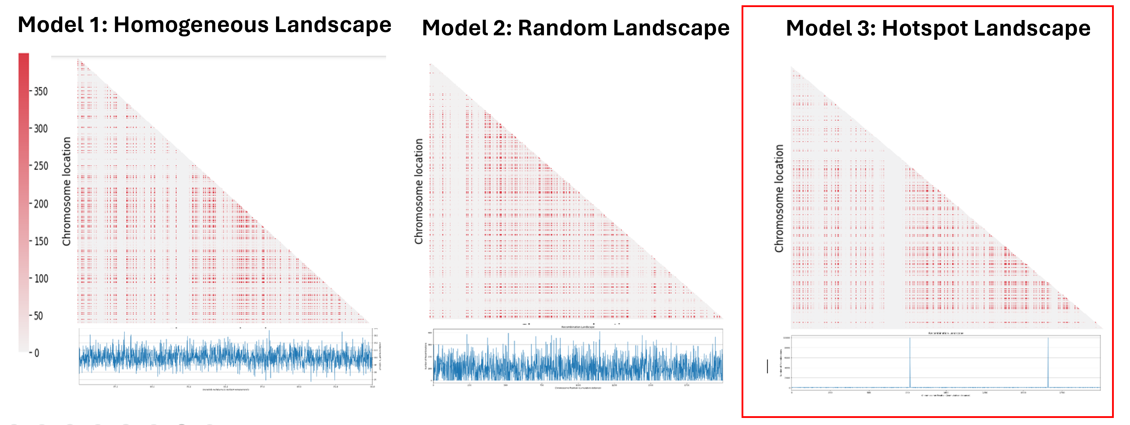
The next step was to understand the impact of the recombination landscape on linkage disequilibrium. To do that we have calculated parameter D, which quantifies the non-random association of alleles, and then used it to represent the result with a heatmaps where the more red the region is, the more associated the genes are. In this case only the last generation of the simulation was represented. We then analyzed the heatmaps for the homogenous recombination landscape since the recombination is homogenous is the same for all intergenic regions, we didn’t notice any particular pattern, and so there is no formation of LD regions. We can draw a similar conclusion for the random landscape model: in fact, even if the recombination rate is non homogenous, it is distributed homogenously across the chromosome, not allowing the formation of particular LD regions. However, in the hotspot landscape, a distinct LD regions is formed, so we decided to focus our analysis on this model.
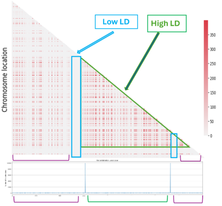
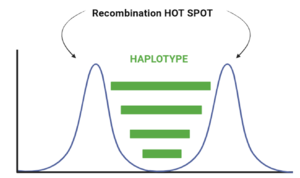
When we look at the Hotspot landscape, we can clearly identify 2 regions: the one highlighted in green, which is localized between the two hotspots and is characterized by high linkage disequilibrium, and the one in blue, which represents the within hotspot regions and shows a zero linkage disequilibrium. In fact, high recombination breaks down LD within the hotspot. On the other hand, the regions between hotspots tend to have lower recombination rates. Consequently, the alleles in these regions are less shuffled and often remain linked over generations. These regions are called haplotypes:
Linkage disequilibrium
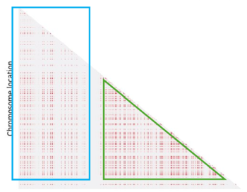
Even if we can identify a pattern, it doesn't fully meet our expectations. In fact we expected to see more LD regions (in light blue) and the one we have identified is not clearly defined (in green):
This could be due to three main factors:
- Mutations and genetic drift introduce noise and disrupt linkage between genes
- The absence of selection allows more fluctuation in the allelic frequencies and consequently prevents the complete fixation of linkage between genes
- We used only the last generation to create the heatmaps, and so there is a possibility that we have lost some information that were present in the previous generations
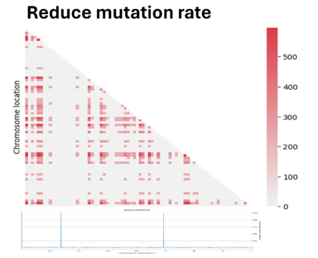
So we tried to play a bit with parameters to see if we could improve the quality. First we have reduced the mutation rate by 100. However, since we applied an infinite allele model, the reduction of mutation has led to fewer different alleles present in the population, making the population mostly homogeneous and making it difficult to measure linkage between genes. In fact most regions showed zero linkage disequilibrium.
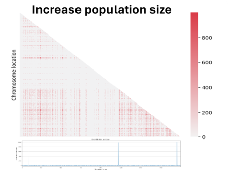
Then we decided to also double the population size. We see here that the noise caused by genetic drift in the LD has decreased, but at the same time the LD signal has also decreased. In fact, the bigger the population is and the more difficult it is to see the same linked genes in all individuals in the population if there are favored by natural selection.
Next steps
The next steps would be the implementation of natural selection and allelic fitness to observe how LD regions can be favored if they have a positive impact on fitness. In addition, to improve the results, we could collect LD information from multiple generations and join them in a unique heatmap.


