Bacterial growth
Project presented by Riccardo Boccaletti and Sabrina Da Cunha Rua
Supervised by Ilaria Iuliani
Contents
Introduction
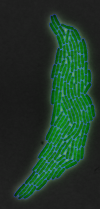
There are several billion bacterial species in the world, but although they have been studied, some of their processes still remain to be clarified. In this project, we focused on the growth and division of a specific bacterial species Escherichia coli. E. coli is one of the most frequently used species in research and teaching, so we have a lot of data on this species. We know that E. coli is a rod-shaped bacterium that grows at a temperature of 44.5 °C and lives in the intestinal tract of warm-blooded, gram-negative, aerobic and facultative anaerobic, non-spore-forming bacteria. Reproduction of this bacterium occurs by cell division.
In this project, we tried to understand at what point in the bacterial growth the cell division of E.coli occurred. We therefore tried to find correlations between division and different cellular values such as: increase in cell volume, increase in cell area, increase in the length of the long axis of the bacterium, and others.
We also tried to see if bacterial growth was also exponential at the individual cell level as well as at the colony level.
The results of this research could help improve bacterial projections and models for fundamental bacterial research.
Materials and Methods
E.coli image database
To obtain data on Escherichia coli cells, we used images from a database used in an experiment by another research group (van Vliet et al 2018).
The cells were transformed with plasmids to mark certain proteins with fluorescence and the different colonies were then grown overnight at 37°C in a shaking incubator.To obtain images of cell growth microscopy was carried out on agar buffers treated differently to meet the different needs of each cell culture maintained at a constant temperature of 37°C by an incubator. The bacteria were also provided with an air supply to allow them enough oxygen for aerobic growth during time-lapse microscopy. Images were taken every 3 minutes (rpsM, elongation rate) for several hours by a microscope with a 100X NA1.3 oil objective (Olympus) and an F-View II CCD camera.
We then took these images made available in a database of this study for analysis (van Vliet et al 2018). We used the data from experiment 1: E1-1, E1-5, E1-6 and from experiment 3: E3-11
Image J
We first uploaded the cell images into an image processing software to reduce them to 50%. This was done because the images taken from the database had too high a magnification to be uploaded to MatLab. We therefore had to reduce them so that the SuperSegger software could correctly distinguish and follow the cells once the images were uploaded to MatLab, preventing it from dividing them into too small pieces that did not correspond to the actual individual cells.
SuperSegger
Having arranged the image sequences through ImageJ, we uploaded them to a MatLab-based software called SuperSegger. SuperSegger allows us to perform segmentation and tracking on image sequences obtained from the microscopy of growing cell cultures. Segmentation is a process that enables the identification and separation of objects from their background. The algorithm used binarises the images into foreground and background pixels based on the intensity distribution of the pixels in the original image, the objects of interest are then represented by the foreground pixels. The software we used specifically is suitable for the recognition of rod-shaped cells, such as E.coli. In addition, Supersegger incorporates machine learning algorithms to optimise cell boundaries and reduce segmentation errors that may occur.
Following segmentation, SuperSegger performs tracking. It consists of tracking the movements of objects in the images throughout the time-lapse image sequence. To do this, the algorithm combines the object in one image with the nearest object in the next frame, taking into account the distance, size and shape of the tracked objects.
The tracking also includes a correction step based on the probability that such a tracking is correct, which allows for greater accuracy.
At the end of these two processes SuperSegger can also include a phase for extracting the characteristics of the cells on the image sequences, such as size, shape but also fluorescence intensity in the case of experiments with labelled proteins. We used this function to extract the matrices with the cell data for analysis with Rstudio.
Rstudio
Having extracted the matrices from Matlab of the different experiments, we downloaded MatLab packages from Rstudio to import and analyse them.
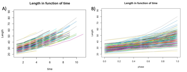
With Rstudio, we created graphs to see the growth of the length, area and volume of each individual cell in experiment E1-11 according to both actual growth time and normalised time (which we call cell cycle phase) (figure 1B). To calculate the cell cycle phase between 0 and 1, we used the formula:(t-t_min)/(t_max-t_min ). In this way time 0 corresponded to the birth of the cell while time 1 corresponded to the cell division of the same cell. In order to have less noisy data, we used a control threshold for the time: it had to correspond to at least one cell life that was three frames long. Furthermore, to further improve the data, we took data with a correlation threshold between the variable and time in frames of at least 0.98.
Finally, to calculate the volume used for our graphs we used the formula:
V = [(w^2 · π/4) · (l − w)] + (π · w·3/6) taken from another article (Loferer-Krößbacher et al 1998).
Using Rstudio, we then produced histograms to see the density of the distribution of long axis length, area and volume at cell birth and death. To complete these histograms, we added trend curves to see which curve best fit the density distribution (Figures 2). To produce these curves, we used either a normal distribution whose mean and standard deviation matched those of the data in the matrices obtained from the experiments in the van Vliet et al 2018 study, or a Poisson distribution again based on the data and the mean of the actual observed data from van Vliet et al 2018.
We produced the same graphs for the difference in length on the long axis at death and at birth, the difference in area at death and at birth, and the volume at death and at birth.
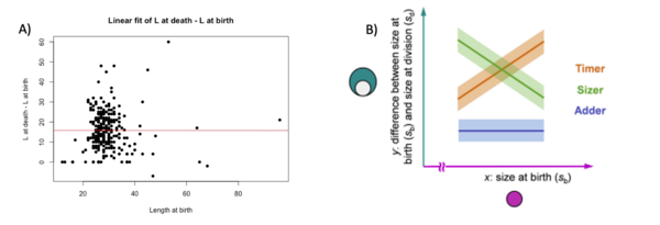
We then made a linear fit of the graphs of the difference of length at death and length as a function of length at birth, the same graphs were also made for area and volume.
We also made exponential fits on the total growth of the length, area and volume of all the cells according to their stages in the cell cycle.
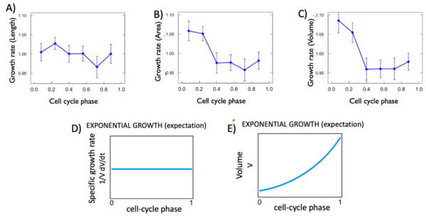
Finally, cell growth rate graphs were made for width, area and volume. Growth rate is defined as: the discrete derivative of length (or area or volume) as a function of time.
Results and Discussion
In these results, we will only represent the results concerning length for reasons of convenience, as the valid results for length are also similar for area and volume. Furthermore, it is based on a single measurement extracted directly from the SuperSegger matrices, so length is a less noisy value than the other two. The only graphs shown for all three measures considered are the graph showing the logarithm of certain cell values (length, width, area and volume) and the growth rate graphs.
We first investigate the basic parameters of the cells in function of time. The three variables that we analyzed are length, area and volume. The length and the area were extracted from the Matlab matrix and directly used to build the graphs. The volume was calculated using others variables but was not an information directly accessible form the matrix. In the graphs shown below we can see that the bacteria growths over time, as we expected.
We then concentrated on the same variables but at different times. In the matrix, we had accessed to the values of the cells at birth and at death. The birth measurements are picked when the cell is right after a division. The death measurements are picked when the cell is right before a division. We decided to have a general look at this by building histograms. Histograms gave us a complete view of the variables that we wanted to study. We used two fit to see the expectation of our graphs: the Gaussian fit, and the Poisson fit. In general, for discrete variables, the Poisson fit describes better the tendencies of the data. For our data we found that, in most of the cases, the Gaussian model fit better the data. This variance is due to the inaccuracy of the measurements took from SuperSegger and to the variance add from us in the calcul of the Volume. We decided to also create the graph for the values at death minus values at birth to see graphically if a variable could describe the growth of the cells. Here below we can see the histograms of the length. The graphs show a big variance in the data and that the length seems to not describe the growth.
We decide to perform a linear fit on the difference between death and birth in fonction of the birth to see if there is a correlation at the start of the cell and at the end. Normally, in this situation, there are three possibilities: the timer line, the sizer line and the adder line. The timer represent a 1 slope line, where at each length at birth the difference at death – birth augment. The adder represent a 0 slope line where there is no correlation between the two variables. The sizer represent a -1 slope line where at each length at birth the difference at death – birth decreases (Facchetti et al 2017). In our cases, we found that for each variable the fit resemble an adder fit. We didn’t found a correlation between birth and difference between death and birth. Here below the graphs:
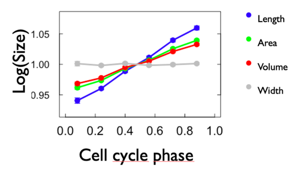
To compare the growth rate, we made a graph of the logarithm of each variable in fonction of the cell phase. To do so, we calculated the mean of each variable for each cell phase and we put it in form of logarithm. We also added the width to the graph. We expect that the slope of length, area and volume is positive and that the slope of width is 0. As we can see from Figure 4, expectations have been met. Length has the biggest growth rate compared to the others. Area and volume have more or less the same growht rate and width is close to zero. Here below the graph:
For each variable, we calculated the istantaneous growth rate. This type of growth rate refers to the discrete derivative of the growth rate at each cell phase. As we can see Figure 5 D and E, the expectation for an exponantial growth are that. The variable in fonction of time grows in an exponential way with a curve and the discrete derivative in fonction of phase remain flat. For each of our variable this was not the case. In fact, as shown in Figure 5, all of the istantaneous growth rates vary in fonction of time, which is not expected. This is probably due to the phase of the cell cycle they are in.
Conclusion
Preliminary analysis of the machine's results seems to indicate promising usability of the embedding space for potential inference on correlation with some image's phenotypes such as number of bifurcations and others. If it were proved to be meaningful by a more thorough analysis it would give important insight as to what the model learns and how it behaves. Other analysis like the training of a classifier on the embedding space for potential predictability of vascular diseases could show promising results. The possibility of using the embedding for potential genetic correlations would be interesting for gaining insights into one's genotype simply by a retinal vasculature image.
Acknowledgements
A special acknowledgement goes to Ilaria Iuliani, assistant for the course " Solving Biological Problems that require Math 2023". for having followed, helped and supported us throughout this project in a professional and attentive manner.
References
Reference 1:
van Vliet, S., Dal Co, A., Winkler, A. R., Spriewald, S., Stecher, B., & Ackermann, M. (2018). Spatially Correlated Gene Expression in Bacterial Groups: The Role of Lineage History, Spatial Gradients, and Cell-Cell Interactions. Cell Systems, 6(4), 496-507.e6. https://doi.org/10.1016/j.cels.2018.03.009
Reference 2:
Loferer-Krößbacher, M., Krößbacher, K., Klima, J., & Psenner, R. (1998). Determination of Bacterial Cell Dry Mass by Transmission Electron Microscopy and Densitometric Image Analysis. In APPLIED AND ENVIRONMENTAL MICROBIOLOGY (Vol. 64, Issue 2). https://journals.asm.org/journal/aem
Reference3:
Facchetti, G., Chang, F., & Howard, M. (2017). Controlling cell size through sizer mechanisms. Current Opinion in Systems Biology, 5, 86–92. https://doi.org/10.1016/J.COISB.2017.08.010
Documents
You can find here our final PDF report: File:Bacterial growth and division in E coli.pdf
